


 B learning to play the guitar with the help of my zine. This one stands out a bit from the series of three because the lighting isn't great. i was rushing for a print slot.
 A-M with vegetables. Bloody Vegans. I really like the composition though. Cant really crop the image because of it though - kinda need the veg, the zine and A-M's head to fully communicate the image.
 Ahh, in context. Look at me. In the household. With a zine. And a hammer. possibly able to crop out the hammer.
 Should have RGB'd the order of the posters. bit more layout griddy this layout though.
 All the products all spread out, product shot innit. Check out the RGB layout. Got hte household one the wrong way round though.
 Band 2 was cropped a bit for the final product. Check out my package!
 Band 1 - Thinnest. More like a surface design pattern. Works ok. Maybe too small to be recognisable as the icons?
 Band 2 - Standard! Possibly too much extra space above and below the logo.
 Same as about with continuous lines! Not inkeeping with the series of booklets tho.
 left align? Perfectly in series with booklet except for bold individual title text that appears on them.
  ooh, open up that box!
  Beautiful products.
 Posters in series.
 Close up of the posters in series.

 I really like the negative ones. They are in series with the booklets but also separate.


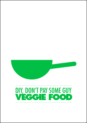
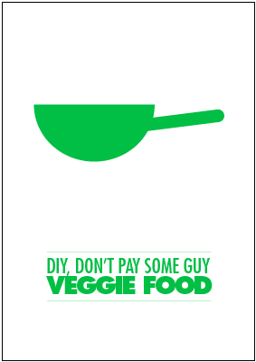
Promo poster designs for the pack. I like the simplicity but the veggie icon is shorter than the other two and this kind of takes it out of the series. slightly disappointing. Having it more in the space doesnt really work either.
 Basic ideas for promotional badges! Just using the logo for each booklet (these are the original colour schemes and original ideas. Activism (cyan placard) will be scrapped in favour of fashion (which has no logo as of yet). I just think that, although this is less "me", more people will be interested in making their own fashion items.
 This is my wok. It is a tracing for the stir fry section.
 This is a soup pot. It is for the soup recipe.
 A shelf diagram. It shows you how to screw.
 Diagram of how to bleed a radiator.
How to restring a guitar! This is the most important thing in the world that no one ever considers.


Photos for vector tracing! (see above)

 The 3rd of A4 issue is solved relatively easily. A5 double page spread in indesign with the three different booklets on anyway. boom!


I decided that i wanted to experiment with unusual paper formats. A4 sheet, landscape, split into 3 rows, separated and then folded in half to create the double page spreads. When one A4 sheet is double sided i can make a 12 page booklet out of it. Not too shabby for a non-standard paper format and pretty efficient use of paper as well!
Sticking to the 3's i used a 6 column grid. This meant some differentiation was possible but it kept the layout in series.
HOWEVER. I ran into small problem here. I designed the indesign document to be a double spread of 1 third of an A4 page. This seemed like a good idea but i quickly realised that printing it would waste 2 thirds of the A4 sheet.
This kind of defeats the entire logic behind my idea of using this format.

Notation, scales and fingering! the hand diagram is necessary so that people know which finger to use in scales and chords. It is naff, i know. but it is more necessary than naff. Also, the scales and notation are visualised in the same way as the chords structures.
 I also drew up the diagrams of some open strings chords. 9 might seem like a weird number but they all come in useful. I plan to include info about which chords run well together as well.
Since guitar is one of the few things i feel i have a forte in, i figured it was a good place to start contents-wise. I decided people might need a diagram of the instrument with labels so i simply traced a product shot off the internet in illustrator and added pointing lines to name each part of the instrument.
 Trying out a few different colours for each idea. I think the top 3 are the ones that i am going to use for the final series. RGB is a pretty decent colour scheme for a series set, riiight? or is just a little too cliche? i dont know why im asking you. i'm gonna do it like that anyway.
JUST TO REMIND MYSELF, the codes for the colours i have chosen are as follows:
Red = C: 20%, M: 100%, Y: 100%, K: 0%
Green = C: 75%, M: 0%, Y: 100%, K: 0%
Blue = C: 87%, M: 67%, Y: 0%, K: 0%
 Some initial title design ideas. the icons are all very straight forward but i like them all and think that they visualise each title quite well - weird how i made the designer left handed tho.
This is in Futura STD because i am going through a Futura STD stage. its just so flexible with all the different weights and condensities (that is now a real and official typographic word). So let's just call it a design decision and not wonder why i havent seen what it would look like in comic sans or papyrus.
Just be glad its not courier again.
 potential layouts for A-format. They should as consistent as possible, but this may not be that easy to achieve since the information to be presented varies so much.
 The format of the cover has a few different possibilities. the icon chosen for each booklet should probably be smaller than some of these ideas suggests.
 After a few different ideas, i decided that a series of booklets would be more effective. guitar info, household tasks and vegetarian recipes are the 3 parts of the series. I also want to have a little icon that visualises what each booklet is about.
 Chord diagrams and numbered fingers.
 Step by step for putting the string on. Would need to be better organised and formatted.
 Restringing a guitar is something that not many people do quite right. The little diagram in the box is hugely important but no one really acknowledges it.
 Cup of tea is similarly not money saving, its just something that everyone HAS TO GET RIGHT. may be hard to include the idea of how different people like their tea.
 Visualising the tasks in a step by step manner with a scruffy cartoony aesthetic. Tying a tie is not really the best example of "DIY not pay some guy" since there's no payment involved, however it is a great example of step by step instructional graphics.
 My initial idea was a single booklet/publication/zine that gives the reader the knowledge of how to do various day to day tasks around the house that they would generally call in someone else to do for them at great expense. I started by listing some examples of such tasks and thinking about basic layouts and formats.
 potential layouts for A-format. They should as consistent as possible, but this may not be that easy to achieve since the information to be presented varies so much.
 The format of the cover has a few different possibilities. the icon chosen for each booklet should probably be smaller than some of these ideas suggests.
 After a few different ideas, i decided that a series of booklets would be more effective. guitar info, household tasks and vegetarian recipes are the 3 parts of the series. I also want to have a little icon that visualises what each booklet is about.
 Chord diagrams and numbered fingers.
 Step by step for putting the string on. Would need to be better organised and formatted.
 Restringing a guitar is something that not many people do quite right. The little diagram in the box is hugely important but no one really acknowledges it.
  Cup of tea is similarly not money saving, its just something that everyone HAS TO GET RIGHT. may be hard to include the idea of how different people like their tea.
 Visualising the tasks in a step by step manner with a scruffy cartoony aesthetic. Tying a tie is not really the best example of "DIY not pay some guy" since there's no payment involved, however it is a great example of step by step instructional graphics.
 My initial idea was a single booklet/publication/zine that gives the reader the knowledge of how to do various day to day tasks around the house that they would generally call in someone else to do for them at great expense. I started by listing some examples of such tasks and thinking about basic layouts and formats.